UI/UX Design
Designing an App That Tells You to Stop
Take It Easy is our self-initiated concept for an AI assistant that plans breaks around your work. What the research says, and how it shaped the design.
- Verstack Studio
- Nov 4, 2026
- 2 min
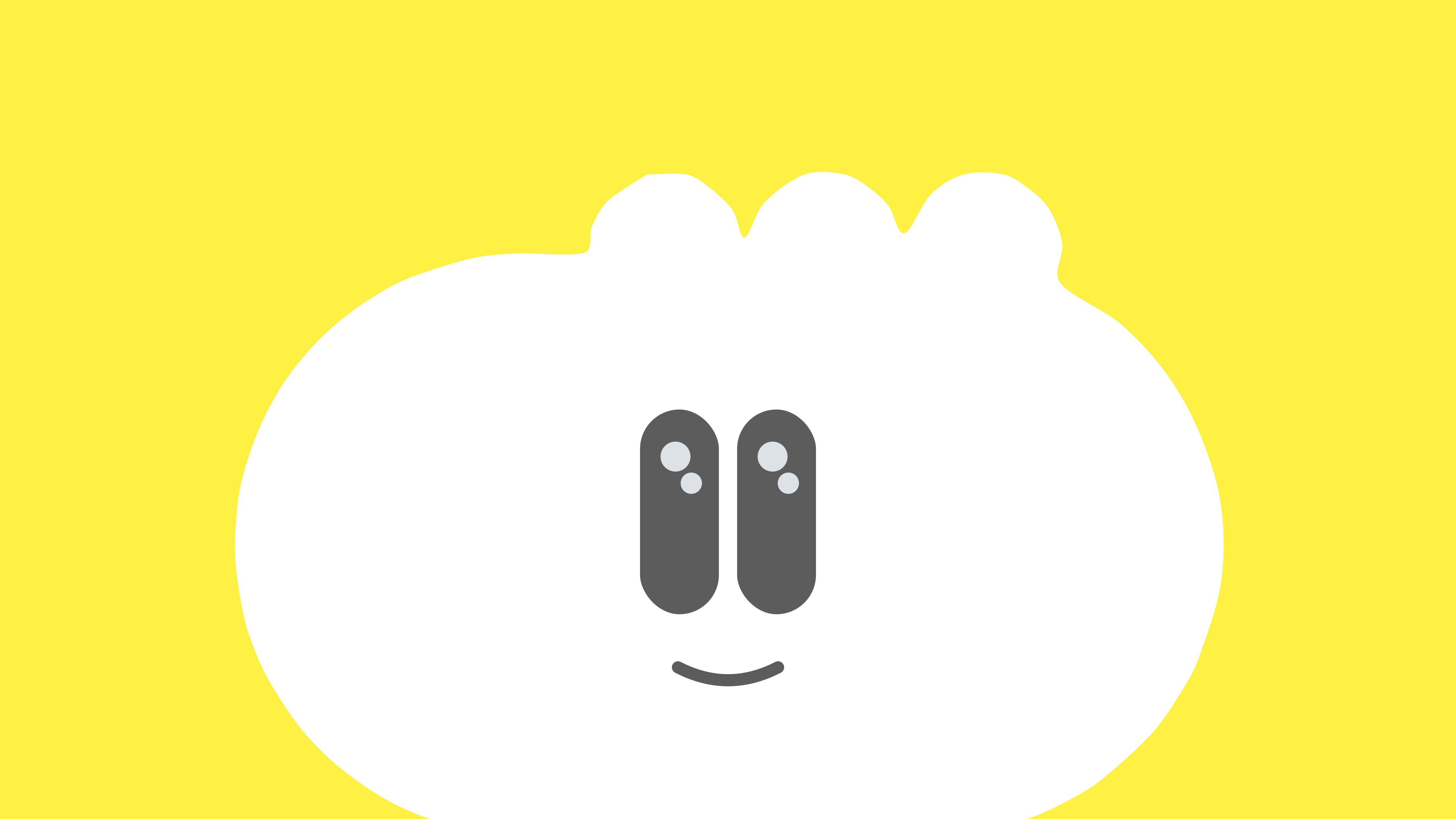
Most apps want more of your attention. Take It Easy is a self-initiated concept for one that wants less: an AI assistant that plans breaks around your work, so busy people don't burn out. We ran the research, named it, drew its cloud character and designed the app and its UI kit. It's a concept, not a shipped product, and that gave us room to think about what an app like this should be.
Start with what burnout is
The word gets used loosely. The World Health Organization classes burn-out as an occupational phenomenon, not a medical condition, with three dimensions: exhaustion, mental distance or cynicism, and reduced professional efficacy. ICD-11 says it results from chronic workplace stress that hasn't been successfully managed, and that it applies only in the occupational context.
That matters for design. An app can't cure a bad workplace, and it shouldn't suggest that it can. It can help with one thing: making it easier to stop.
What breaks really do
We wanted to be careful about what we promised. A 2022 systematic review and meta-analysis in PLOS ONE on micro-breaks looked at 22 samples and 2,335 people. Breaks of no more than 10 minutes boosted vigour and reduced fatigue. But the overall effect on performance wasn't significant.
That's a helpful finding. "Rest and you'll get more done" is the usual pitch, and the evidence doesn't really back it up here. "Rest and you'll feel better" is both true and a better reason.
A face instead of a timer
A timer that tells you to stop feels like another boss. So the app's assistant is a character: a soft cloud with 6 body shapes, each with its own eyes and mouths. It's hard to feel nagged by a cloud.

Character design isn't decoration here. It's how a product that interrupts you stays welcome. The same goes for the name. "Take it easy" is what a friend says.
Calm isn't empty
The app has 5 sections, from Relax to SOS, and SOS matters: it's there for the moments when a scheduled break isn't what someone needs. The look is yellow, white and soft grey. It needed to feel warm, while still being clear enough to use when you're tired.
Why make concepts at all
Client work rarely lets you start from a question like this. Self-initiated projects test ideas, and some go further. We keep a lot of our tries in LaBS, including moving studies of this one.
The same care for how a product behaves shows up in client work, such as Warburg AI's single accent colour. See the full case study, or our UI/UX design page.


